Practical-7 PowerBI
Introduction to PowerBI and Get started with PowerBI, Prepare data for analysis and Model data in Power BI
Power BI
Power BI is a business analytics service by Microsoft. It aims to provide interactive visualizations and business intelligence capabilities with an interface simple enough for end users to create their own reports and dashboards.
Which different types of visualization it provides?
Here are the visualizations types in Power BI:
1. Area Charts
2. Line Charts
3. Bar Charts
4. Column Charts
5. Combo Charts
6. Pie Charts, and many more.
Lets get started with Power BI
- Loading dataset in excel format.

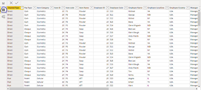
2. You can view your data in tabular form by clicking Data icon.

3. Preparing data for analysis

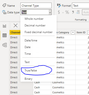
Converting Channel Type Column to Boolean from binary
4. You can view model view of data by clicking model icon

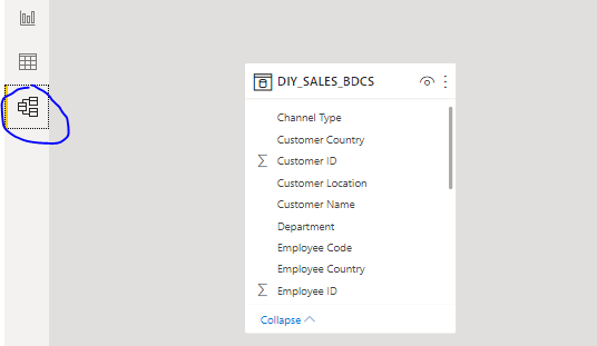
Or you can this :
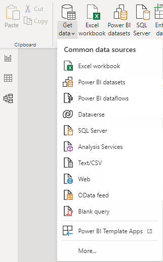
Step 1: Import data to Power BI Dashboard
Without numbers, there is no data to visualize, so the third step of Power BI dashboard creation is to import data. To do so in your Power BI Desktop Dashboard press on Home > Get Data > Choose a data source > Connect.
Step 2: Format data in Power BI Dashboard
After you’ve selected your data source, the Power BI dashboard starts processing it and organizes what it has found in the new Navigator window. In the example below, you can see how Power BI found two components displayed on the left side of the window — Document and Ranking of the best and worst states for retirement.
Select the data that interest you to see a preview. Here you have a perfect chance to format your future Power BI data visualization by choosing Transform Data or press Load to visualize it as it is.
Step 3: Create Data Visualization in Power BI Dashboard
Here’s great news! After importing data to your Power BI dashboard it’s quite simple to create actual data visualization dashboard elements.
All you have to do is look at your right-hand Fields panel and check or drag-and-drop the desired field, like in this case Abbreviation, Affordability, Overall rank, State or Weather, onto the Power BI dashboard.
In case you want to create another Power BI dashboard that shows correlations between various values, just check the values you’re interested in visualizing in the Fields section we described below, and Power BI will automatically generate a data visualization.
You can choose the visualization type by simply clicking on any Bar, Pie or Donut chart or any other Data Visualization methods and types under the Visualizations tab on the right side of the panel.
Congratulations! You are done! Your Power BI Desktop Dashboard has been created! Keep adding other Power BI charts and graphs to your dashboard.
Thank You!!

Comments
Post a Comment